This document describes the different customizable sections of the Programmable Wallet SDK customization API. To get the most flexibility out of the SDK, use this reference with the SDK API.Documentation Index
Fetch the complete documentation index at: https://developers.circle.com/llms.txt
Use this file to discover all available pages before exploring further.
Colors
setThemeColor(themeColor: ThemeColor)
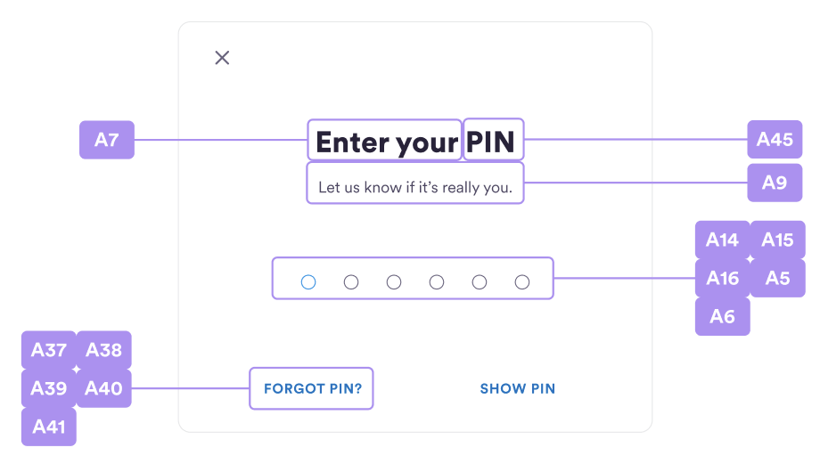
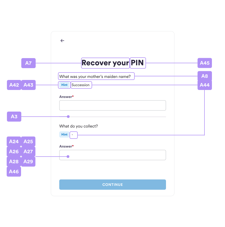
| # | ThemeColor property | Note |
|---|---|---|
| A1 | backdrop | Modal backdrop color, e.g. ‘#000000’. |
| A2 | backdropOpacity | Modal backdrop opacity, e.g. 0.5. |
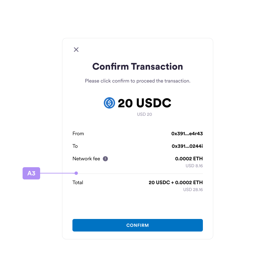
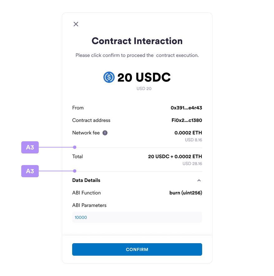
| A3 | divider | Divider border color, e.g. ‘#808080’ or ‘grey’. |
| A4 | bg | Modal background color, e.g. ‘#FFFFFF’ or ‘white’. |
| A5 | success | Success text color, e.g. ‘#008000’ or ‘green’. |
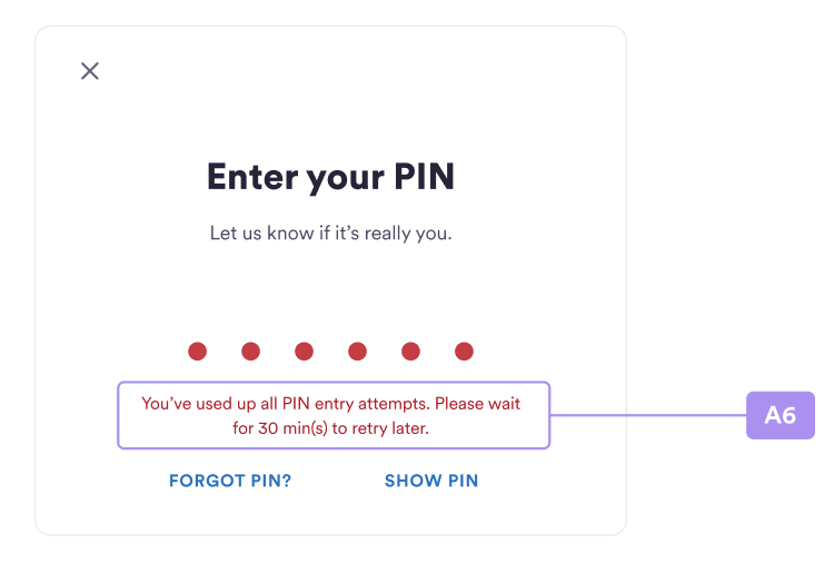
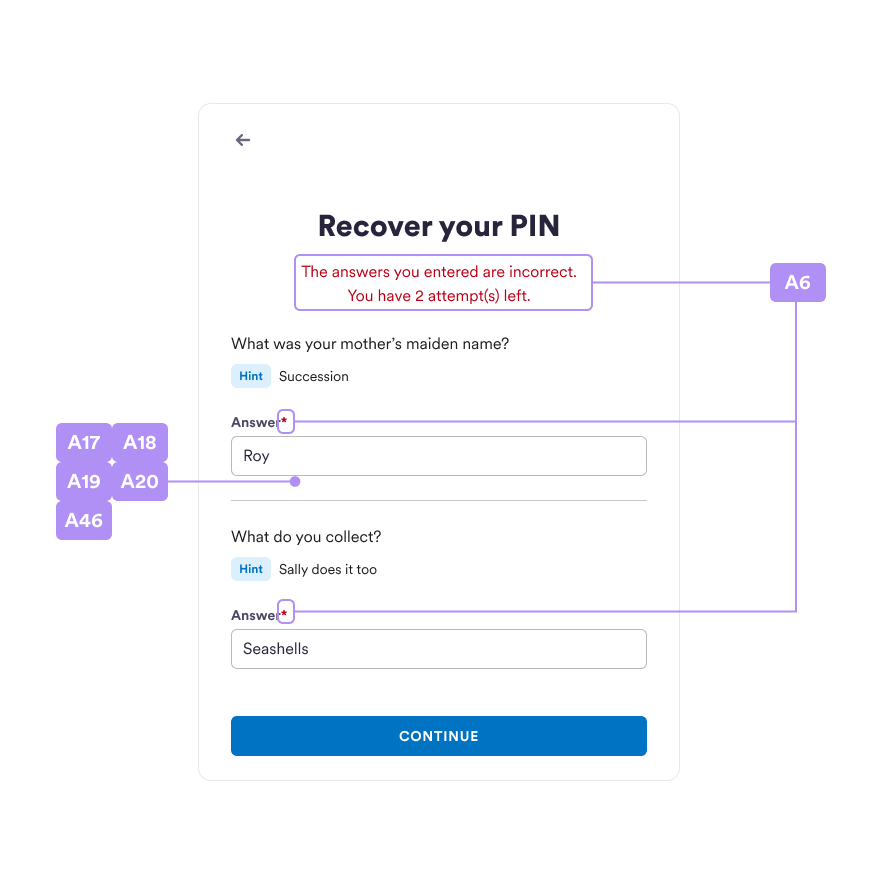
| A6 | error | Error text color, e.g. ‘#FF0000’ or ‘red’. |
| A7 | textMain | Primary color, e.g. ‘#000000’ or ‘black’. |
| A8 | textMain2 | Secondary color, e.g. ‘#000000’ or ‘black’. |
| A9 | textAuxiliary | Primary auxiliary color, e.g. ‘#000000’ or ‘black’. |
| A10 | textAuxiliary2 | Secondary auxiliary color, e.g. ‘#000000’ or ‘black’. |
| A11 | textSummary | Summary text color, e.g. ‘#000000’ or ‘black’. |
| A12 | textSummaryHighlight | Summary highlight text color, e.g. ‘#000000’ or ‘black’. |
| A13 | textPlaceholder | Text input placeholder color, e.g. ‘#808080’ or ‘grey’. |
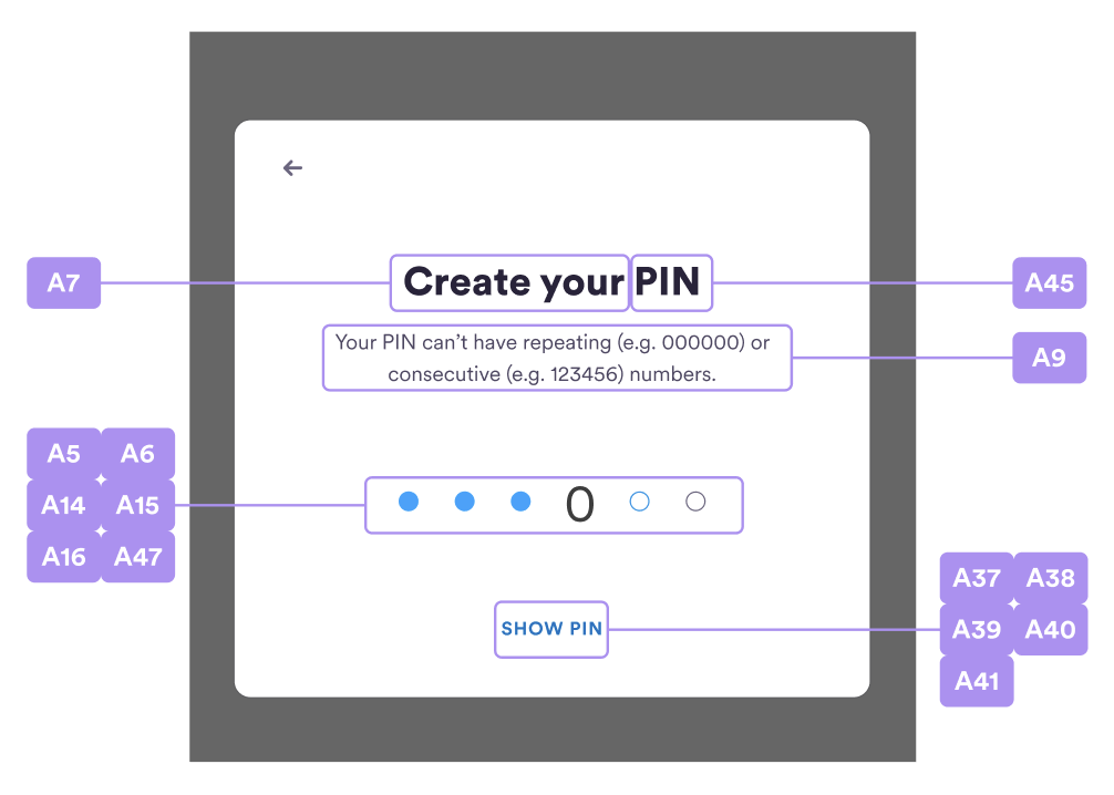
| A14 | pinDotBase | Fill color for pincode input dot, e.g. ‘#FFFFFF’ or ‘white’. |
| A15 | pinDotBaseBorder | Stroke color for pincode input dot, e.g. ‘#000000’ or ‘black’. |
| A16 | pinDotActivated | Fill color for inputted pincode input dot, e.g. ‘#0000ff’ or ‘blue’. |
| A17 | inputBorderFocused | Outline color for text input on focused, e.g. ‘#0000ff’ or ‘blue’. |
| A18 | inputBorderFocusedError | Outline color for text input when error, e.g. ‘#FF0000’ or ‘red’. |
| A19 | inputBg | Background color for text input, e.g. ‘#FFFFFF’ or ‘white’. |
| A20 | inputBgDisabled | Background color for disabled text input, e.g. ‘#FFFFFF’ or ‘white’. |
| A21 | dropdownBg | Background color for dropdown, e.g. ‘#FFFFFF’ or ‘white’. |
| A22 | dropdownBorderIsOpen | Outline color for dropdown is open, e.g. ‘#0000ff’ or ‘blue’. |
| A23 | dropdownBorderError | Outline color for dropdown when error, e.g. ‘#FF0000’ or ‘red’. |
| A24 | mainBtnText | Text color for primary button, e.g. ‘#FFFFFF’ or ‘white’. |
| A25 | mainBtnTextDisabled | Text color for disabled primary button, e.g. ‘#FFFFFF’ or ‘white’. |
| A26 | mainBtnTextOnHover | Text color for primary button on hover, e.g. ‘#FFFFFF’ or ‘white’. |
| A27 | mainBtnBg | Background color for primary button, e.g. ‘#000000’ or ‘black’. |
| A28 | mainBtnBgOnHover | Background color for primary button on hover, e.g. ‘#000000’ or ‘black’. |
| A29 | mainBtnBgDisabled | Background color for disabled primary button, e.g. ‘#000000’ or ‘black’. |
| A30 | secondBtnText | Text color for secondary button, e.g. ‘#000000’ or ‘black’. |
| A31 | secondBtnTextDisabled | Text color for disabled secondary button, e.g. ‘#000000’ or ‘black’. |
| A32 | secondBtnTextOnHover | Text color for secondary button on hover, e.g. ‘#000000’ or ‘black’. |
| A33 | secondBtnBorder | Outline color for secondary button, e.g. ‘#000000’ or ‘black’. |
| A34 | secondBtnBorderOnHover | Outline color for secondary button on hover, e.g. ‘#000000’ or ‘black’. |
| A35 | secondBtnBgOnHover | Background color for secondary button on hover, e.g. ‘#FFFFFF’ or ‘white’. |
| A36 | secondBtnBorderDisabled | Outline color for disabled secondary button, e.g. ‘#FFFFFF’ or ‘white’. |
| A37 | plainBtnText | Text color for plain text button, e.g. ‘#000000’ or ‘black’. |
| A38 | plainBtnTextDisabled | Text color for disabled plain text button, e.g. ‘#000000’ or ‘black’. |
| A39 | plainBtnTextOnHover | Text color for plain text button on hover, e.g. ‘#000000’ or ‘black’. |
| A40 | plainBtnBg | Background color for plain text button, e.g. ‘#FFFFFF’ or ‘white’. |
| A41 | plainBtnBgOnHover | Background color for plain text button on hover, e.g. ‘#FFFFFF’ or ‘white’. |
| A42 | recoverPinHintTitle | Text color for recover pincode hint title, e.g. ‘#FFFFFF’ or ‘white’. |
| A43 | recoverPinHintTitleBg | Background color for recover pincode hint title, e.g. ‘#FFFFFF’ or ‘white’. |
| A44 | recoverPinHint | ext color for recover pincode hint, e.g. ‘#FFFFFF’ or ‘white’. |
| A45 | titleGradients | Background color for linear-gradient text, e.g. [‘#B090F5’, ‘#1AA3FF’]. |
| A46 | inputText | Text color for text input, e.g. ‘#000000’ or ‘black’. |
| A47 | enteredPinText | Text color for entered pincode input, e.g. '#000000' or 'black'. |
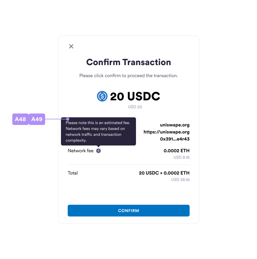
| A48 | tooltipText | Text color for tooltip content text, e.g. ‘#000000’ or ‘black’. |
| A49 | tooltipBg | Background color for tooltip content, e.g. ‘#FFFFFF’ or ‘white’. |
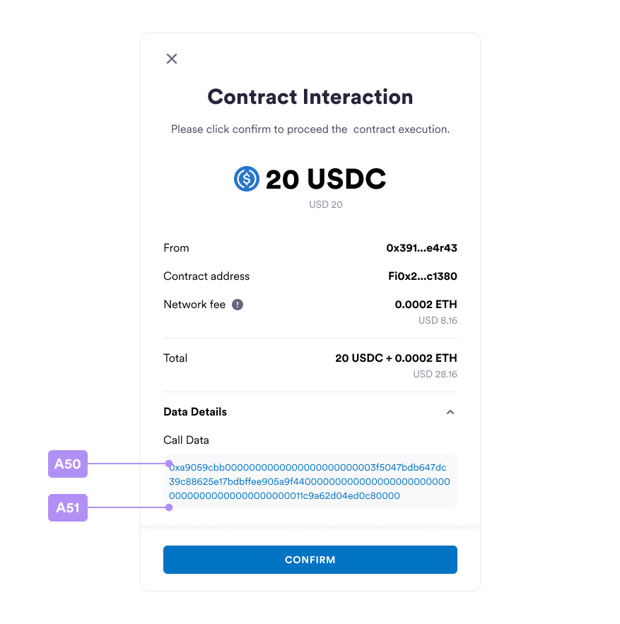
| A50 | textInteractive | Text color for call data and abi parameters |
| A51 | interactiveBg | Container background color for call data and abi parameters |
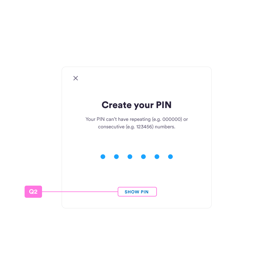
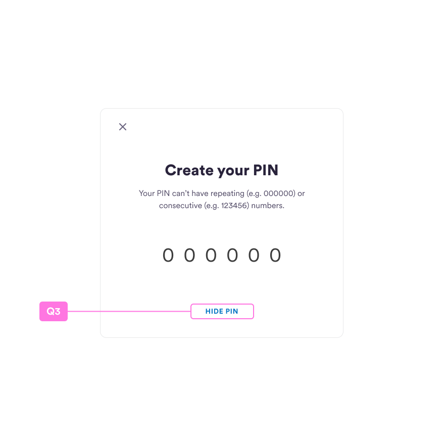
Create your PIN
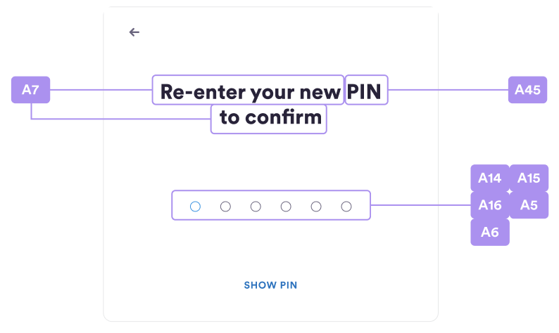
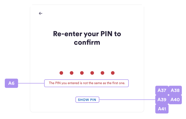
Re-enter your PIN to Confirm
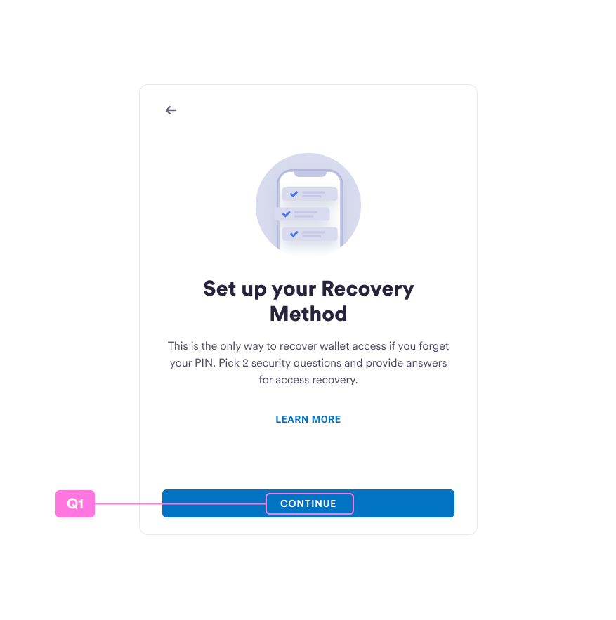
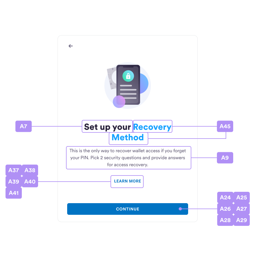
Set up your Recovery Method
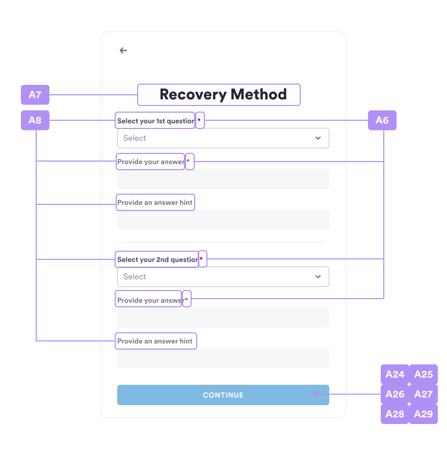
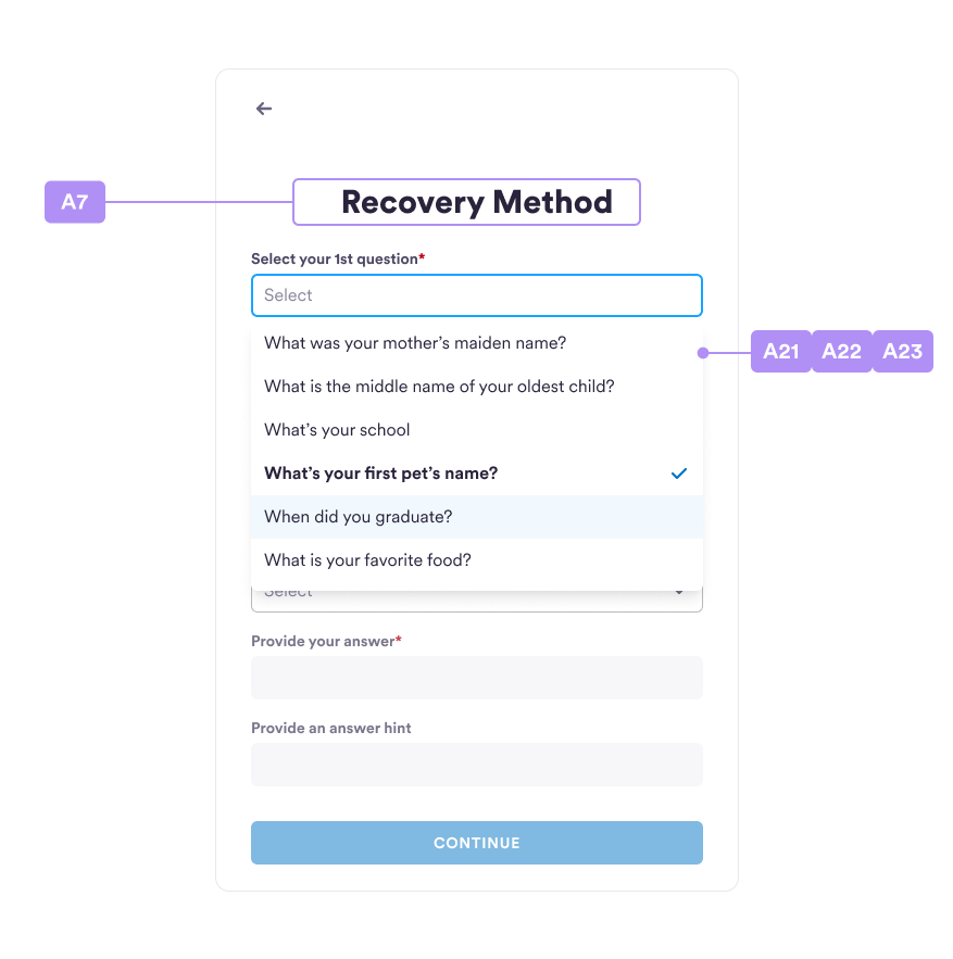
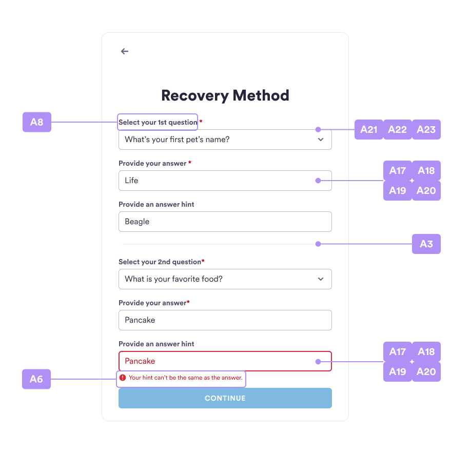
Security Questions Customization
Please reference the Security Question section in the SDK for how to customize the question by usingsetSecurityQuestions method.
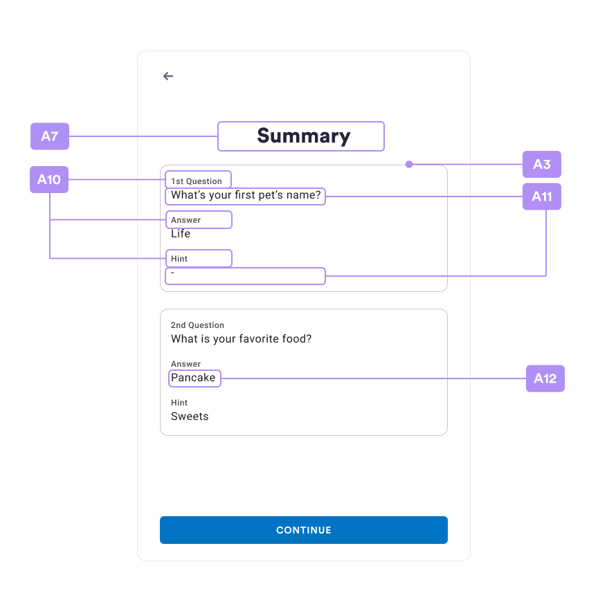
Security Questions Summary
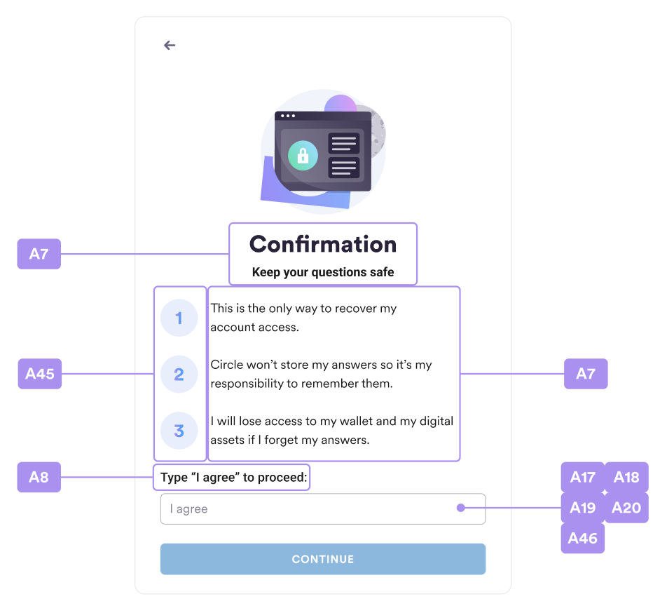
Security Questions Confirmation
Enter your PIN
Recover your PIN
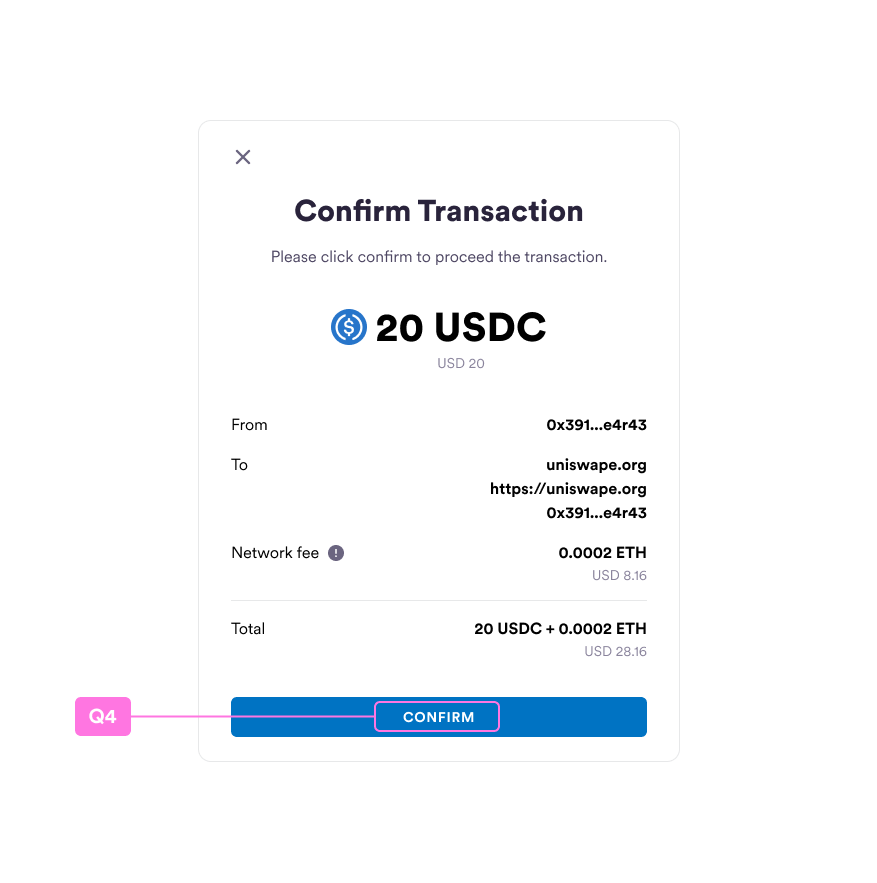
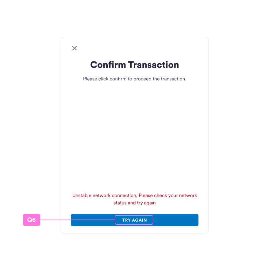
Confirm Transaction
Contract Interaction
Custom security questions
| # | Function | Note |
|---|---|---|
| B1 | setCustomSecurityQuestions( questions?: SecurityQuestion[] | null, requiredCount = 2, securityConfirmItems?: string[]) | Set the array of security questions |
| B2 | setCustomSecurityQuestions( questions?: SecurityQuestion[] | null, requiredCount = 2, securityConfirmItems?: string[]) | Set the required count of security questions. The value is 2 by default. |
| B3 | setCustomSecurityQuestions( questions?: SecurityQuestion[] | null, requiredCount = 2, securityConfirmItems?: string[]) | Set the array of customized disclaimers on the SecurityConfirm screen. The value is undefined by default. |
| B4 | setOnForgotPin(onForgotPin: () => void) | Set the callback of onForgotPin |
Resources
setResource(resources: Resources)
| # | Resources Property | Note |
|---|---|---|
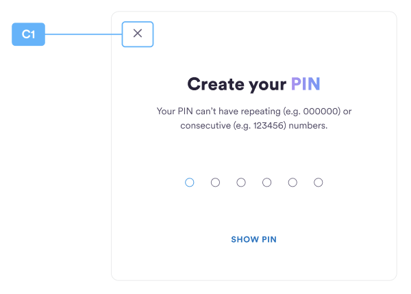
| C1 | naviClose | Close icon url for the navigation bar. |
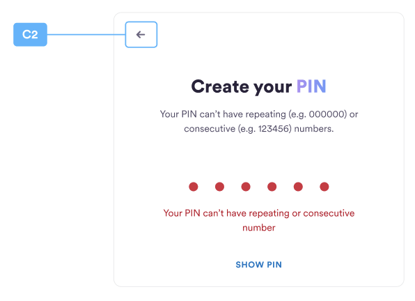
| C2 | naviBack | Back icon URL for the navigation bar. |
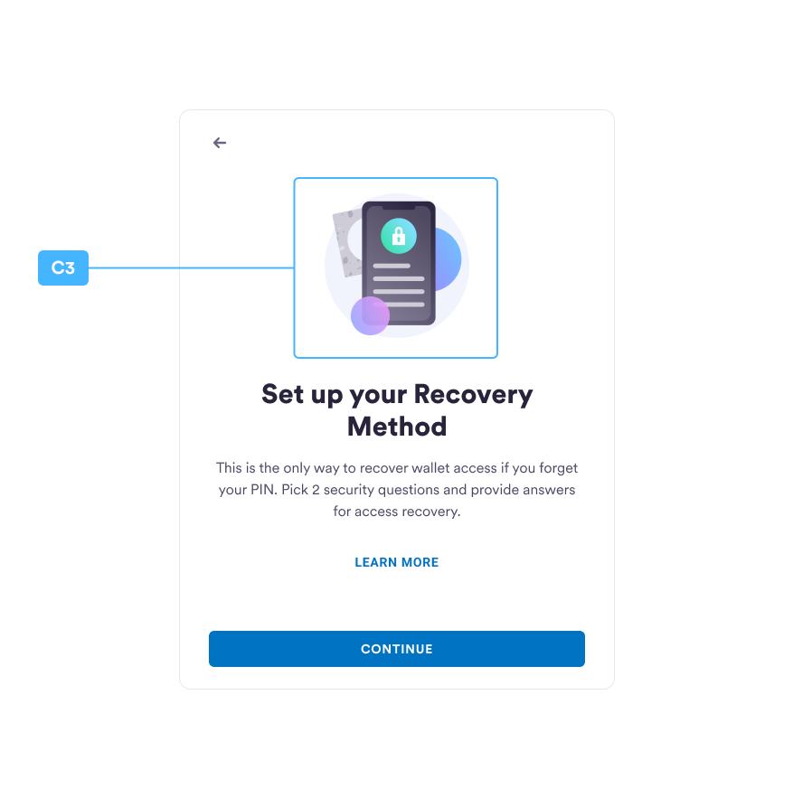
| C3 | securityIntroMain | Security intros image URL for the security intros page. |
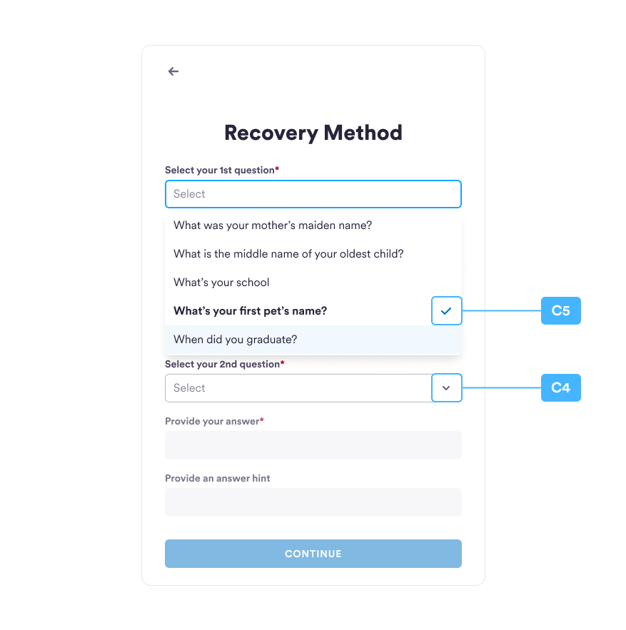
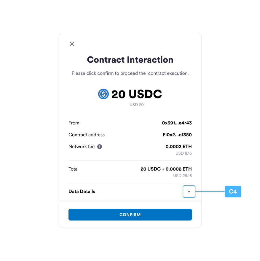
| C4 | dropdownArrow | Arrow icon URL for the dropdown. |
| C5 | selectCheckMark | Selected item icon URL for the dropdown. |
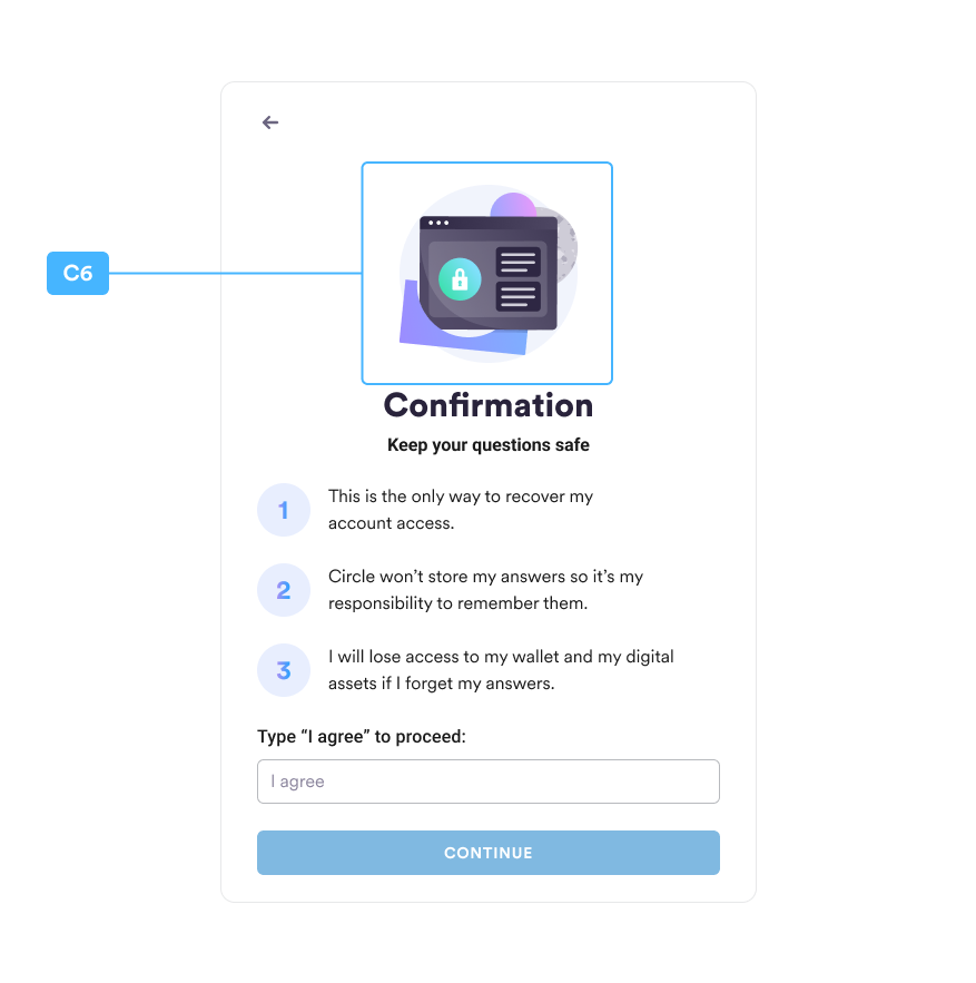
| C6 | securityConfirmMain | Security confirm image URL for the security confirm page. |
| C7 | errorInfo | Error icon for form validation. |
| C8 | fontFamily | Font-family for customization.E.g. { name: 'Edu TAS Beginner', URL: 'https\://fonts.googleapis.com/css2?family=Edu+TAS+Beginner:wght\@400;500;600;700\&display=swap' }. |
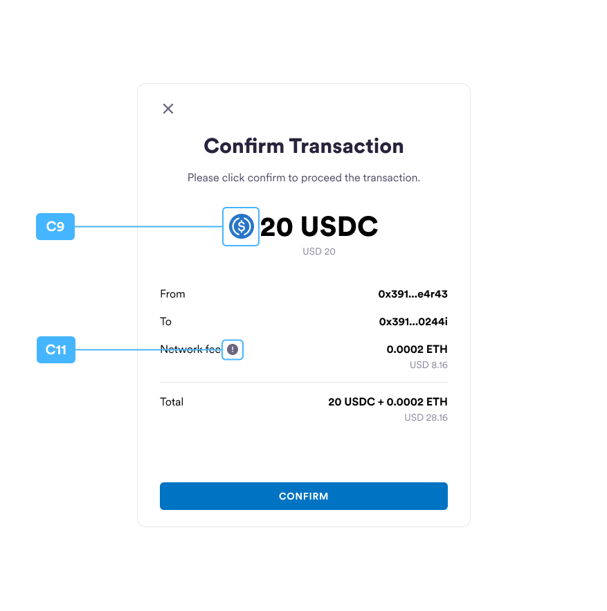
| C9 | transactionTokenIcon | Token icon for the transaction request page. |
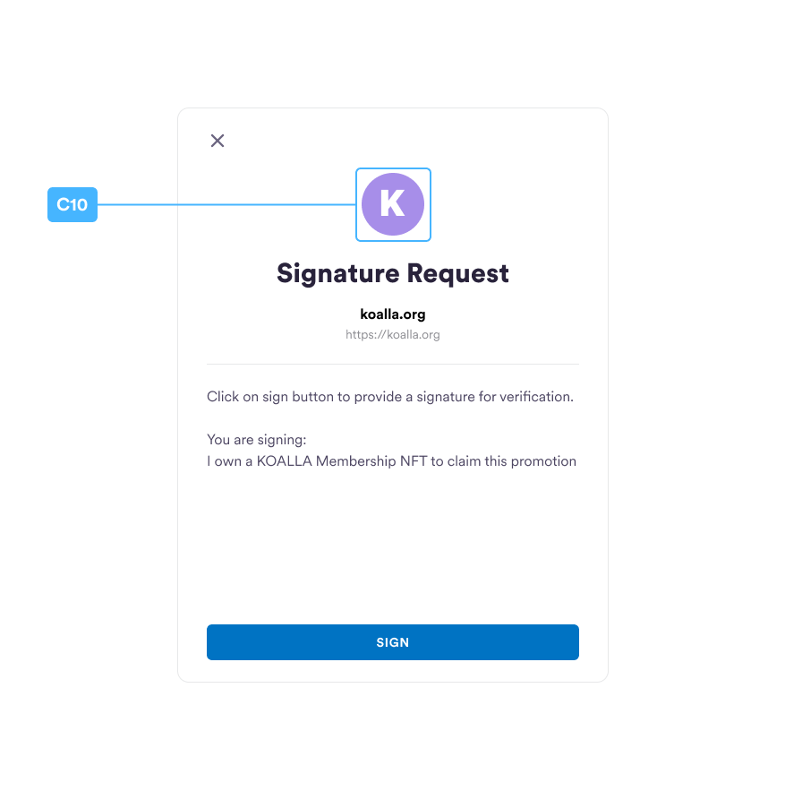
| C10 | dAppIcon | DApp icon for customization for the sign message page. |
| C11 | tipIcon | Tooltip icon for customization. |
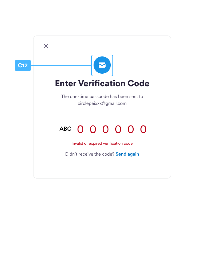
| C12 | emailIcon | Email icon for customization. |
CustomLinks
setCustomLinks(customLinks: CustomLinks)
| # | Custom Links Property | Note |
|---|---|---|
| D1 | learnMoreUrl | External link for the learn more button link. |
Localizations
setLocalizations(localizations: Localizations)
| # | Localizations Property | Note |
|---|---|---|
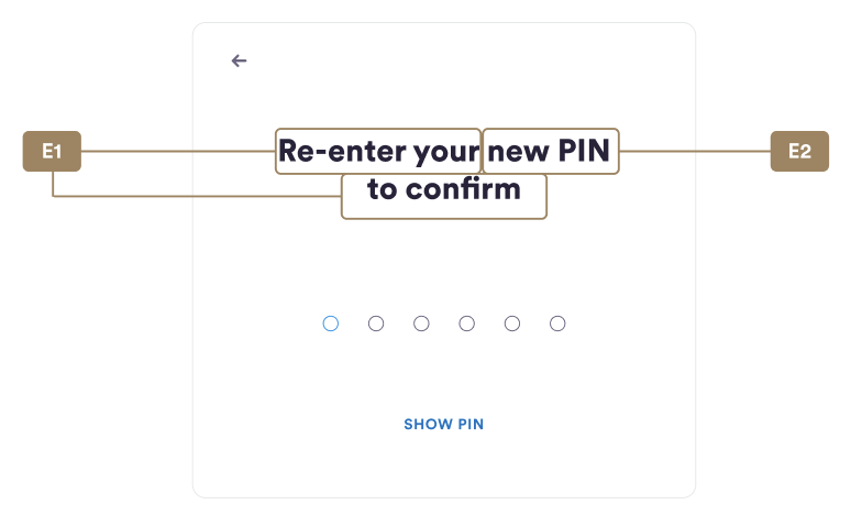
| E1~E3 | confirmPincode | Holds localization settings for ConfirmPincode screen. |
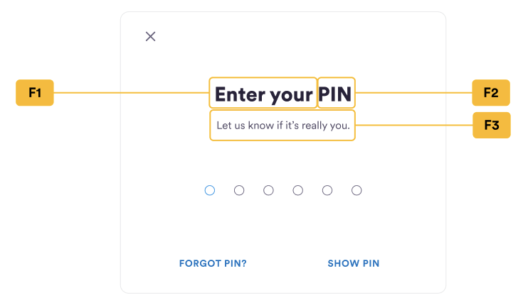
| F1~F4 | enterPincode | Holds localization settings for EnterPincode screen. |
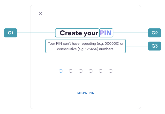
| G1~G3 | newPincode | Holds localization settings for NewPincode screen. |
| H1~H5 | recoverPincode | Holds localization settings for RecoverPincode screen. |
| I1~I5 | securityConfirm | Holds localization settings for SecurityConfirm screen. |
| J1~J4 | securityIntros | Holds localization settings for SecurityIntros screen. |
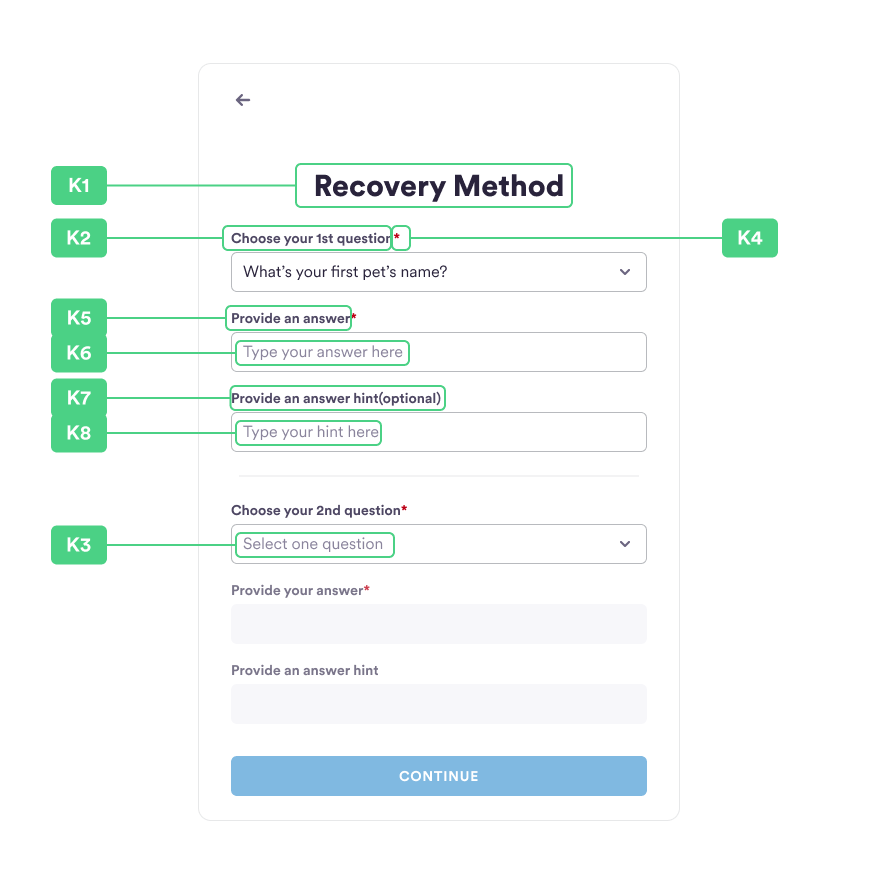
| K1~K8 | securityQuestions | Holds localization settings for SecurityQuestions screen. |
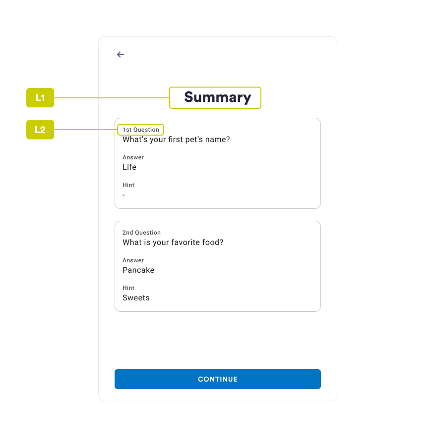
| L1~L2 | securitySummary | Holds localization settings for SecuritySummary screen. |
confirmPincode
| # | Property Name | Note |
|---|---|---|
| E1 | headline | Headline text Keep the placeholder like this: E.g. `Re-enter your {{pin}} to confirm` |
| E2 | headline2 | Headline text 2 The text will replace the {{pin}} placeholder in the headline text |
| E3 | subhead | Subhead text |
enterPincode
| # | Property Name | Note |
|---|---|---|
| F1 | headline | Headline text Keep the placeholder like this: E.g. `Enter your {{pin}}` or `輸入你的 {{pin}}` |
| F2 | headline2 | Headline text 2 The text will replace the {{pin}} placeholder in the headline text |
| F3 | subhead | Subhead text |
| F4 | forgotPin | Forgot pin text |
newPincode
| # | Property Name | Note |
|---|---|---|
| G1 | headline | Headline text Keep the placeholder like this: E.g. `Enter your {{pin}}` or `輸入你的 {{pin}}` |
| G2 | headline2 | Headline text 2 The text will replace the {{pin}} placeholder in the headline text |
| G3 | subhead | Subhead text |
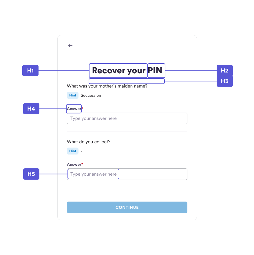
recoverPincode
| # | Property Name | Note |
|---|---|---|
| H1 | headline | Headline text |
| H2 | headline2 | Headline text 2 |
| H3 | subhead | Subhead text |
| H4 | answerInputHeader | Answer input header text |
| H5 | answerInputPlaceholder | Answer input placeholder text |
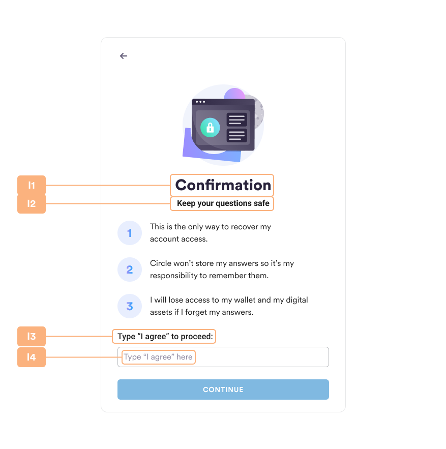
securityConfirm
| # | Property Name | Note |
|---|---|---|
| I1 | title | Title text |
| I2 | headline | Headline text |
| I3 | inputHeadline | Input headline text |
| I4 | inputPlaceholder | Input placeholder text |
| I5 | inputMatch | Input match text |
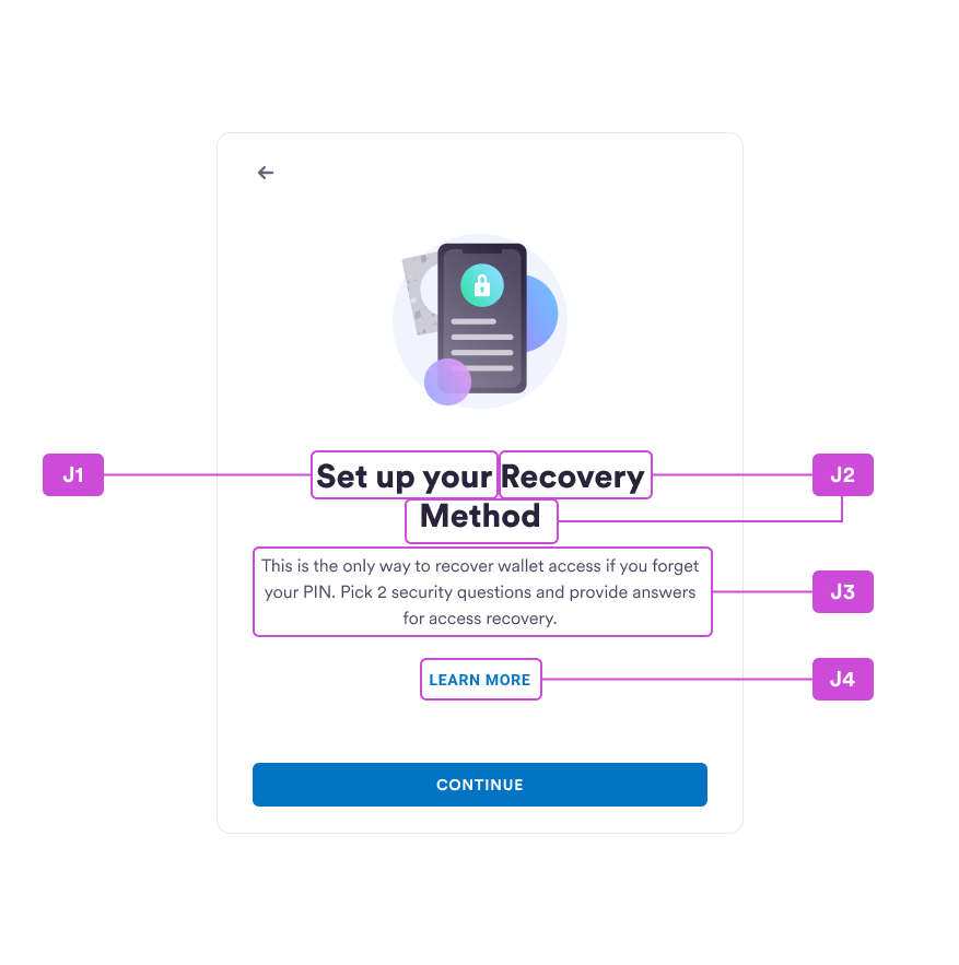
securityIntros
| # | Property Name | Note |
|---|---|---|
| J1 | headline | Headline text |
| J2 | headline2 | Headline text 2 |
| J3 | description | Description text |
| J4 | link | Link text |
securityQuestions
| # | Property name | Note |
|---|---|---|
| K1 | title | Title text |
| K2 | questionHeader | Question header text |
| K3 | questionPlaceholder | Question placeholder text |
| K4 | requiredMark | Required mark text |
| K5 | answerHeader | Answer header text |
| K6 | answerPlaceholder | Answer placeholder text |
| K7 | answerHintHeader | Answer hint header text |
| K8 | answerHintPlaceholder | Answer hint placeholder text |
securitySummary
| # | Property Name | Note |
|---|---|---|
| L1 | title | Title text |
| L2 | question | Question text Keep the placeholder like this: E.g. {{ordinal}} Question {{ordinal}} 質問 or {{ordinal}} вопрос or {{ordinal}} คำถาม You don’t need to place any ordinal value into the placeholder. Web-sdk will do it for you. |
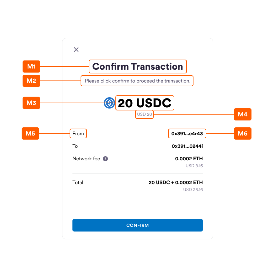
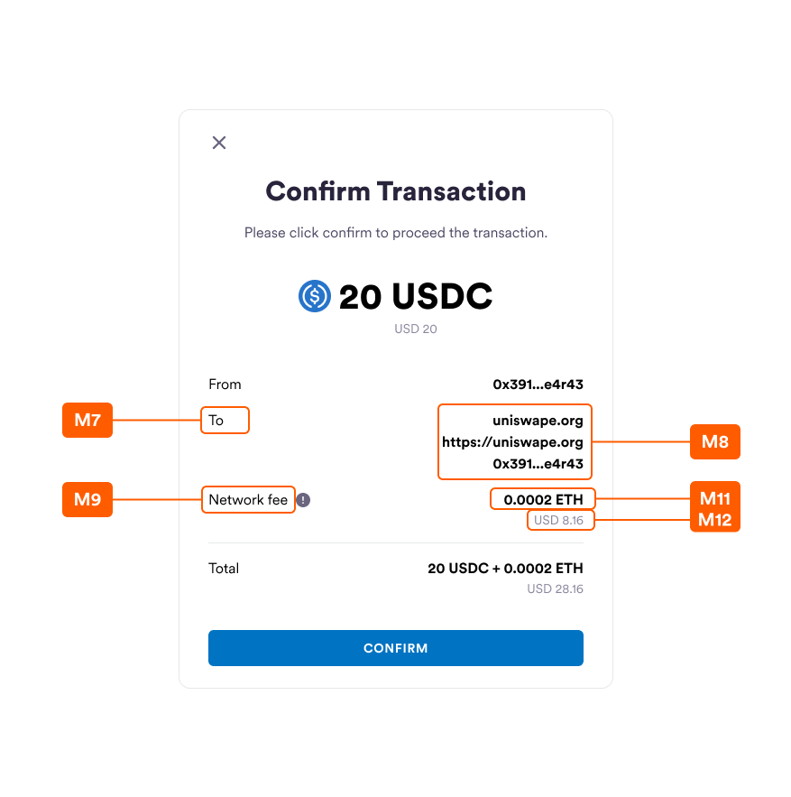
transactionRequest
| # | Property name | Note |
|---|---|---|
| M1 | title | Main title text |
| M2 | subtitle | Subtitle text |
| M3 | mainCurrency | Main currency info, including amount and symbol E.g. { mainCurrency: { amount: 300, symbol: ETH } |
| M4 | exchangeValue | Exchanged currency info, including amount and symbol E.g. { exchangeValue: { amount: 300, symbol: USDC } |
| M5 | fromLabel | From label |
| M6 | from | From value E.g. 0x8De9d7D8503D1DE1566393d7155711B7e4210666 Sdk will do the shortenHash for you. |
| M7 | toLabel | To label |
| M8 | to | To values. This is an array of 3 elements. E.g. [ uniswape.org, https://uniswape.org, 0x8De9d7D8503D1DE1566393d7155711B7e4210666] If you only need to display the address only and you don’t need the dApp name and url displayed, you can input it as follows: [, , 0x8De9d7D8503D1DE1566393d7155711B7e4210666] |
| M9 | networkFeeLabel | Network fee label |
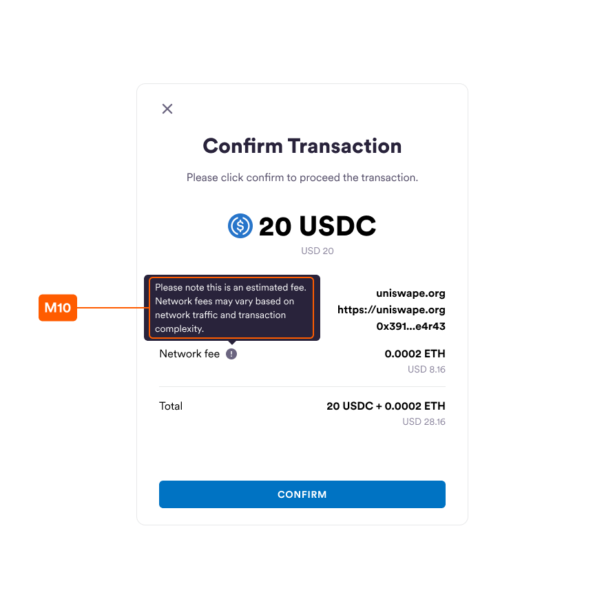
| M10 | networkFeeTip | Text for network fee tooltip |
| M11 | networkFee | Network fee value E.g. 0.005 ETH |
| M12 | exchangeNetworkFee | Exchanged network fee value E.g. 10 USD |
contractInteraction
| # | Property name | Note |
|---|---|---|
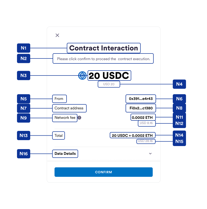
| N1 | title | Main title text |
| N2 | subtitle | Subtitle text |
| N3 | mainCurrency | Main currency info, including amount and symbol E.g. { mainCurrency: { amount: 300, symbol: ETH } |
| N4 | exchangeValue | Exchanged currency info, including amount and symbol E.g. { exchangeValue: { amount: 300, symbol: USDC } |
| N5 | fromLabel | From label |
| N6 | from | From value E.g. 0x8De9d7D8503D1DE1566393d7155711B7e4210666 Sdk will do the shortenHash for you. |
| N7 | toLabel | To label |
| N8 | to | To values. This is an array of 3 elements. E.g. [uniswape.org, https://uniswape.org, 0x8De9d7D8503D1DE1566393d7155711B7e4210666] If you only need to display the address only and you don’t need the dApp name and url displayed, you can input it as follows: [, , 0x8De9d7D8503D1DE1566393d7155711B7e4210666] |
| N9 | networkFeeLabel | Network fee label |
| N10 | networkFeeTip | Text for network fee tooltip |
| N11 | networkFee | Network fee value E.g. 0.005 ETH |
| N12 | exchangeNetworkFee | Exchanged network fee value E.g. 10 USD |
| N13 | totalLabel | Total label text |
| N14 | total | Total values. This is an array of 2 elements. E.g. [20 USDC, + 0.0002 ETH] or [20 USDC + 0.0002 ETH, ] |
| N15 | exchangeTotalValue | Exchanged total value text |
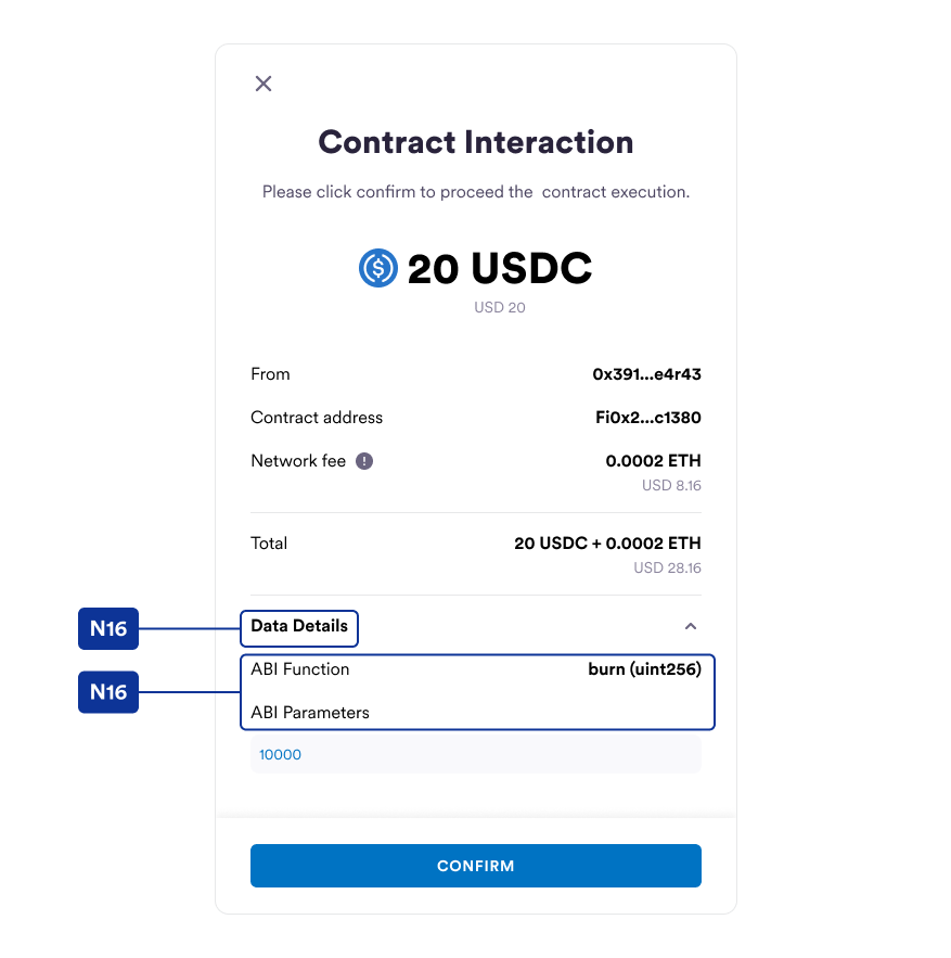
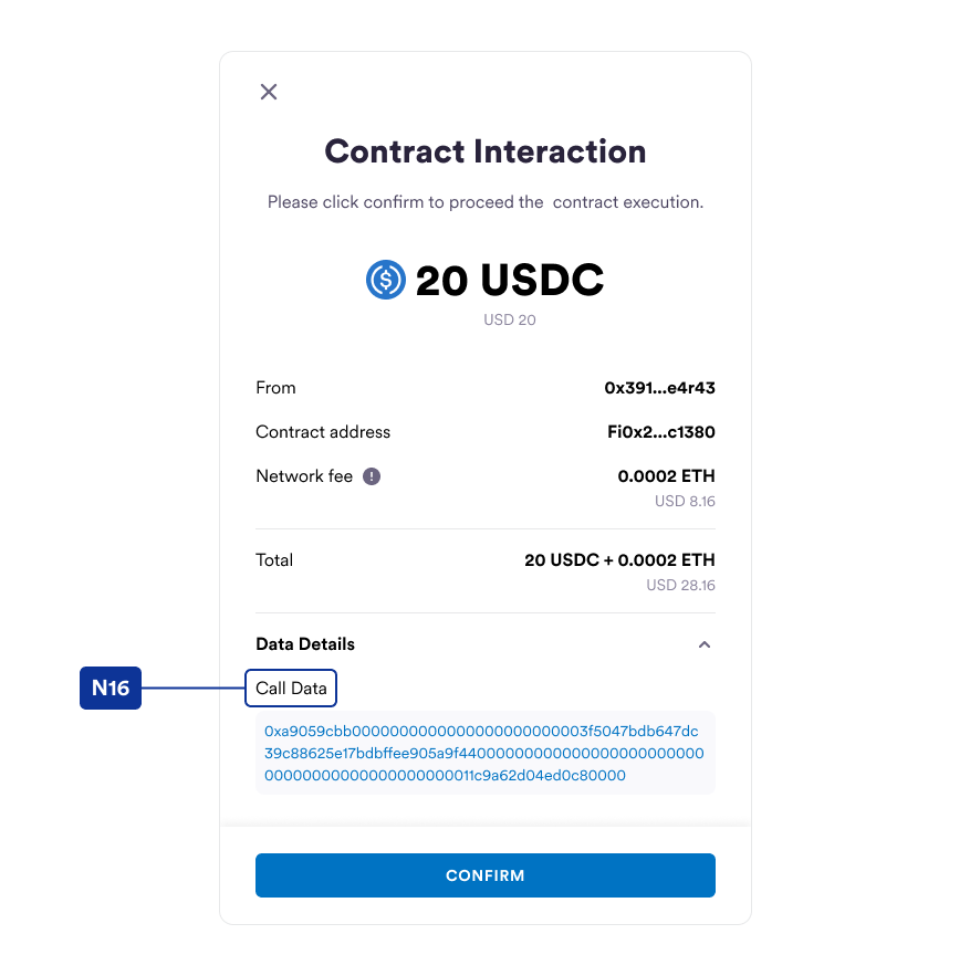
| N16 | dataDetails | An object for contract interaction data detail display. { dataDetails?: { dataDetailsLabel?: string callData?: { callDataLabel?: string data?: string } abiInfo?: { functionNameLabel?: string functionName?: string parametersLabel?: string parameters?: string[] } } dataDetailsLabel: data details label callData or abiInfo: The use could choose either one to fill up depending on the transaction can be parsed by abi (choose abiInfo) or not (choose callData) |
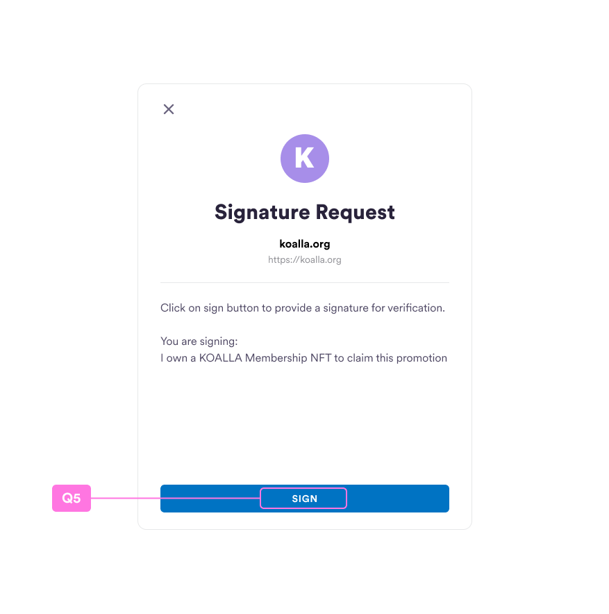
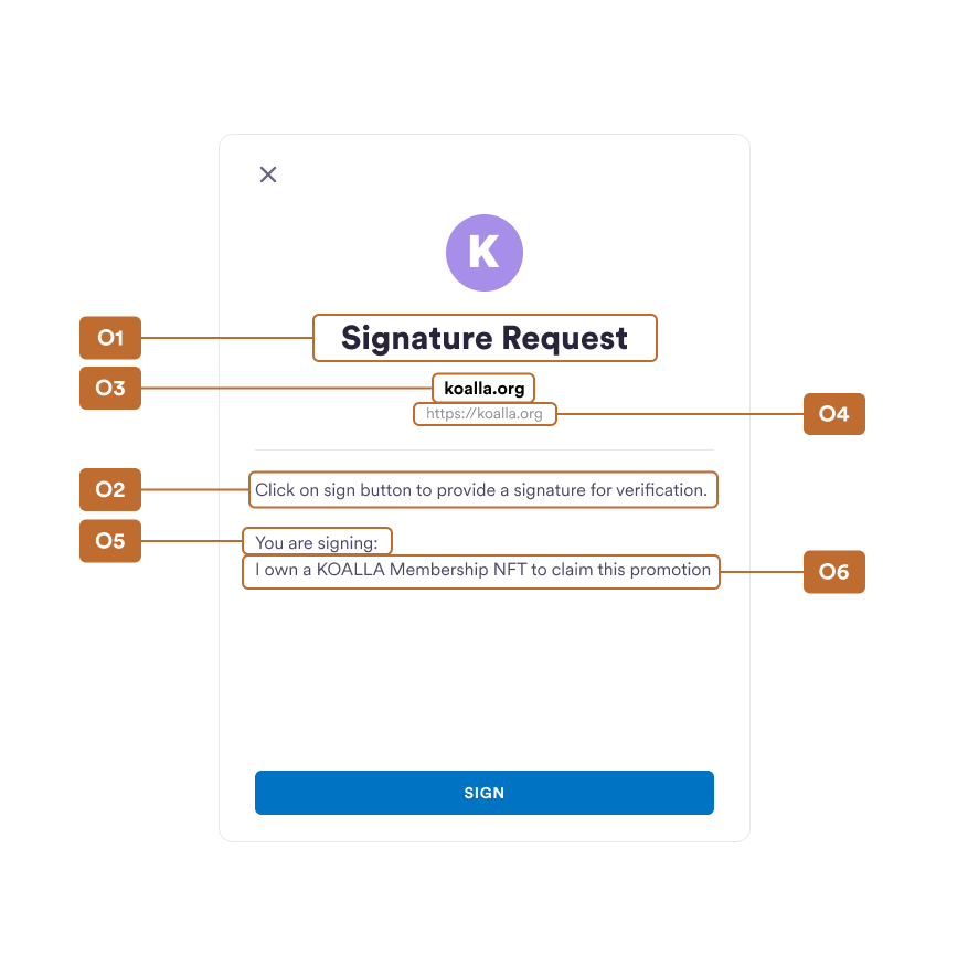
signatureRequest
| # | Property name | Note |
|---|---|---|
| O1 | title | Main title text |
| O2 | subtitle | Subtitle text |
| O3 | contractName | Contract name |
| O4 | contractUrl | Contract url |
| O5 | descriptionLabel | Description label |
| O6 | description | Description |
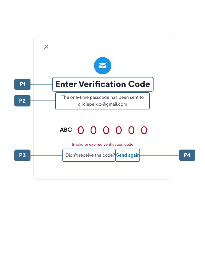
emailOtp
| # | Property name | Note |
|---|---|---|
| P1 | title | Main title text |
| P2 | subtitle | Subtitle text |
| P3 | resendHint | Resend label text |
| P4 | resend | Resend button text |
common
| # | Property name | Note |
|---|---|---|
| Q1 | continue | Continue button text |
| Q2 | showPin | ShowPin button text |
| Q3 | hidePin | HidePin button text |
| Q4 | confirm | Confirm button text |
| Q5 | sign | Sign button text |
| Q6 | retry | Retry button text |